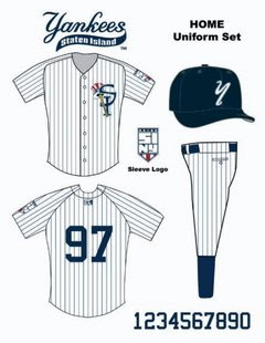

There are several other new logos on the SI Yanks homepage.
The Staten Island Yankees have announced a brand-new look for the 2008 season.This will be the first major uniform change the S.I. Yankees have undergone since their second season when they went from wearing New York Yankees uniforms to the ones they wore through last year.
"The purpose of the new logo is to give a fresh look to the Staten Island Yankees for our 10th season on Staten Island," said team president Joe Ricciutti. "We are honored to be part of this community. As a lifelong Staten Islander, I am particularly proud that each logo, whether it's on our letterhead or on our uniform, demonstrates that the Staten Island Yankees are indeed Staten Island's team."
Executive VP and general manager Jane Rogers believes, "the new logos and uniforms represent a great mix of community pride and Yankees heritage," and in particular likes the addition of a "patch that will adorn the sleeve of every player." The patch Rogers referred to has the giant letters "S.I.N.Y." along with five stars, representing each of the city's five boroughs. The center star is gold and that star represents Staten Island.


3 Comments:
these look great! i can't wait to see em in action!
The picture you are providing is looking great. I also cant wait to see them in action.............
the SI Yanks season starts in June right? So a little over a month still to wait to see these in action.
They are very nice unis, though.
Post a Comment